
Built to lead. Designed to transform.
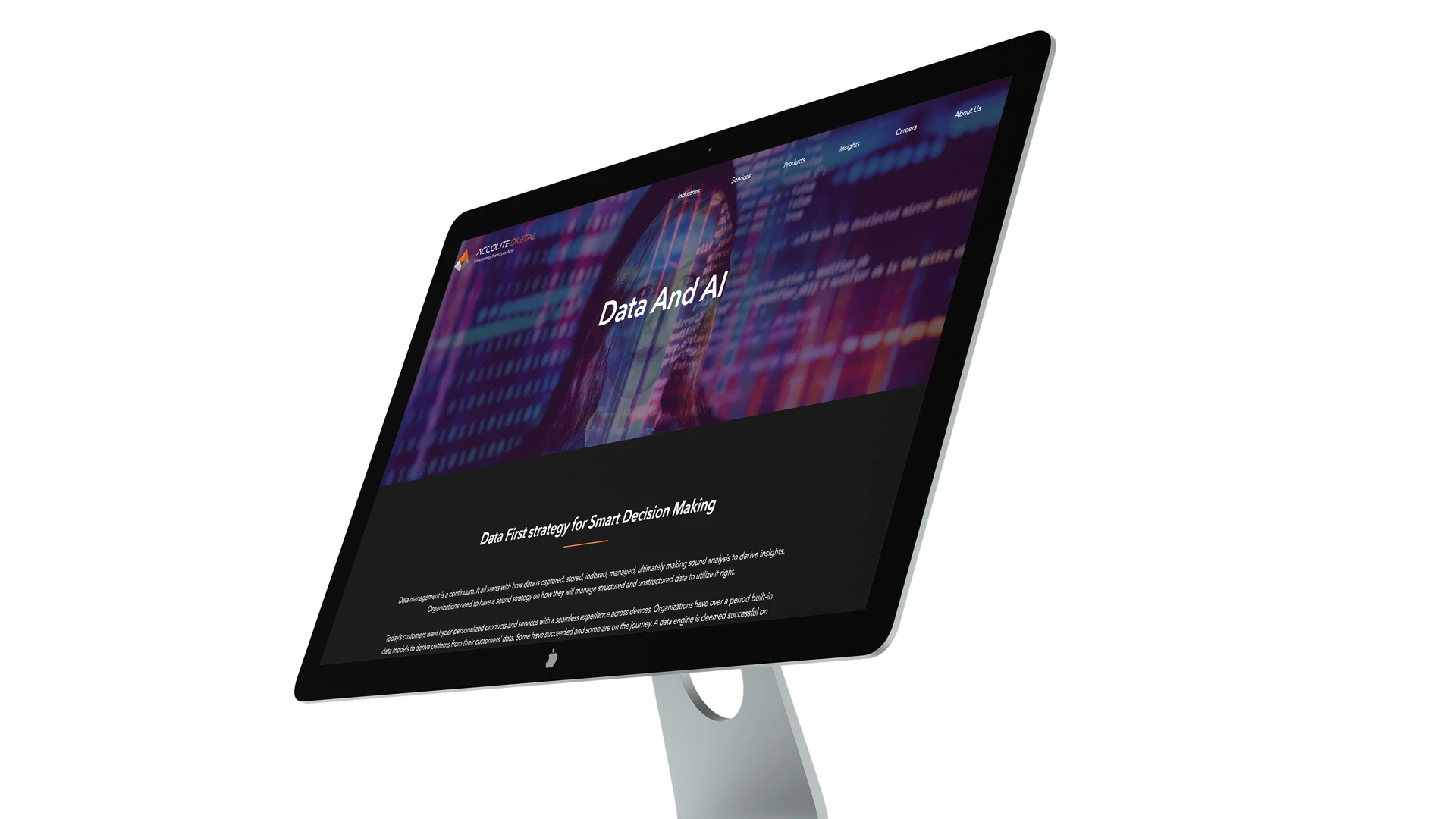
A complete brand overhaul for Bounteous (Accolite), now part of Bounteous, one of the world’s leading digital experience consultancies. From brand strategy and identity to website, collateral, and pitch decks that supported a landmark acquisition.
A company outgrowing its own identity.
Bounteous (Accolite) was a niche technology company delivering complex digital transformation using Agile, Lean, and Design Thinking methodology, serving Fortune 500 clients across the USA. The problem was perception. The existing brand read as a strong technical staffing company, not the forward-thinking, niche transformation partner they had become.
It was time for Accolite to wield a narrative that went beyond IT and software solutions. The brief: design an identity that communicated two things simultaneously, the rigour and precision of a technically elite company, and the energy, culture, and ambition of a place the best and brightest would want to belong to.
The visual and strategic language needed to carry both.
Two words. One system. Every surface.
The entire brand was built from a single strategic decision: reduce the brand language to two words. Transformative and Vibrant. Everything, the mark, the typography, the colour, the collateral, the web, derived from that pairing.
The identity work was led through Rinkled, with full ownership across brand strategy, design, and development oversight. The process began with deep brand workshops with the CEOs, mapping Accolite’s key attributes and distilling a complex, multi-dimensional company into a visual system that could scale across every touchpoint.
The brand exploration was thorough. A new direction was developed and approved, a constellation dot-matrix mark encoding binary script in the letterforms, built around the idea of 360-degree expansion. It was a strong system. But after deeper testing with leadership, the decision was made to return to Accolite’s original triangular mark and redesign it from the ground up rather than replace it entirely. The triangle had equity. The brief became: make it worthy of where the company was going.
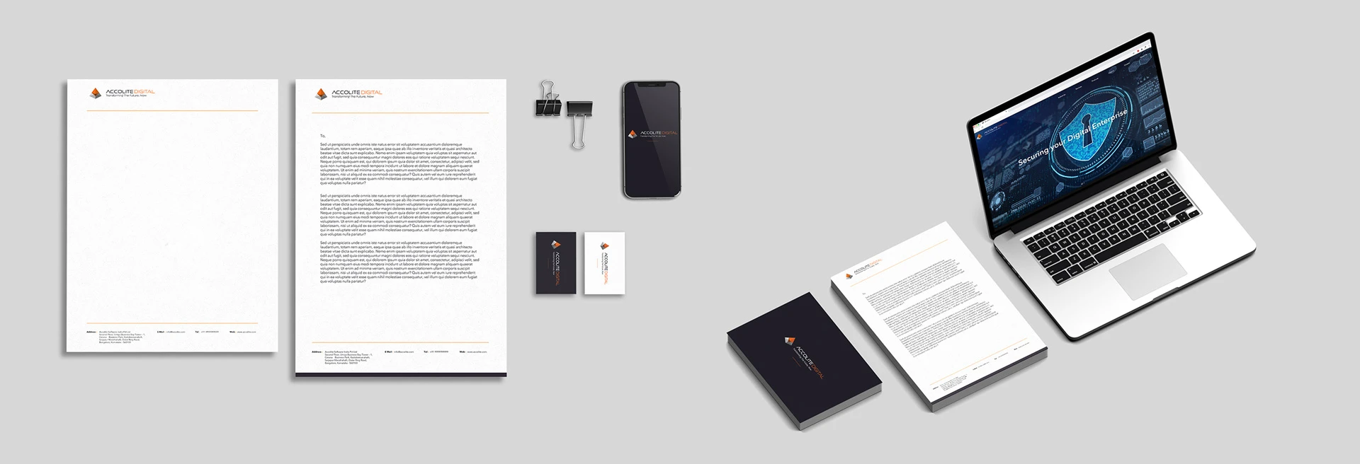
The final approved identity, a precise 3D geometric pyramid in orange and grey, clean, forward, technically confident, became the anchor for the entire system. Paired with “ACCOLITE DIGITAL” in a controlled all-caps wordmark and the tagline “Transforming The Future, Now,” the mark carried both the precision of a technically elite company and the energy of a culture worth belonging to.
The full system extended across: website design and build positioning Accolite as accelerating digital transformation for the Fortune 500, business card system, letterhead, CV templates for executive hiring, and pitch decks used in client and strategic partnership conversations, including the discussions that led to Accolite’s acquisition and merger with Bounteous, now one of the world’s leading digital experience consultancies.
The brand built through Rinkled was the version of Accolite that walked into those rooms.

“Brand is to the world what culture is to the leaders of an organisation. Branding is the process of crafting that culture. That’s where we started.”

Electrip
Plan, charge, explore in one app. Electrip is a full-stack EV trip planning app built for Indian roads, combining intelligent range-aware routing, complete travel itineraries, and AI-powered trip refinement in one cohesive product.
View case →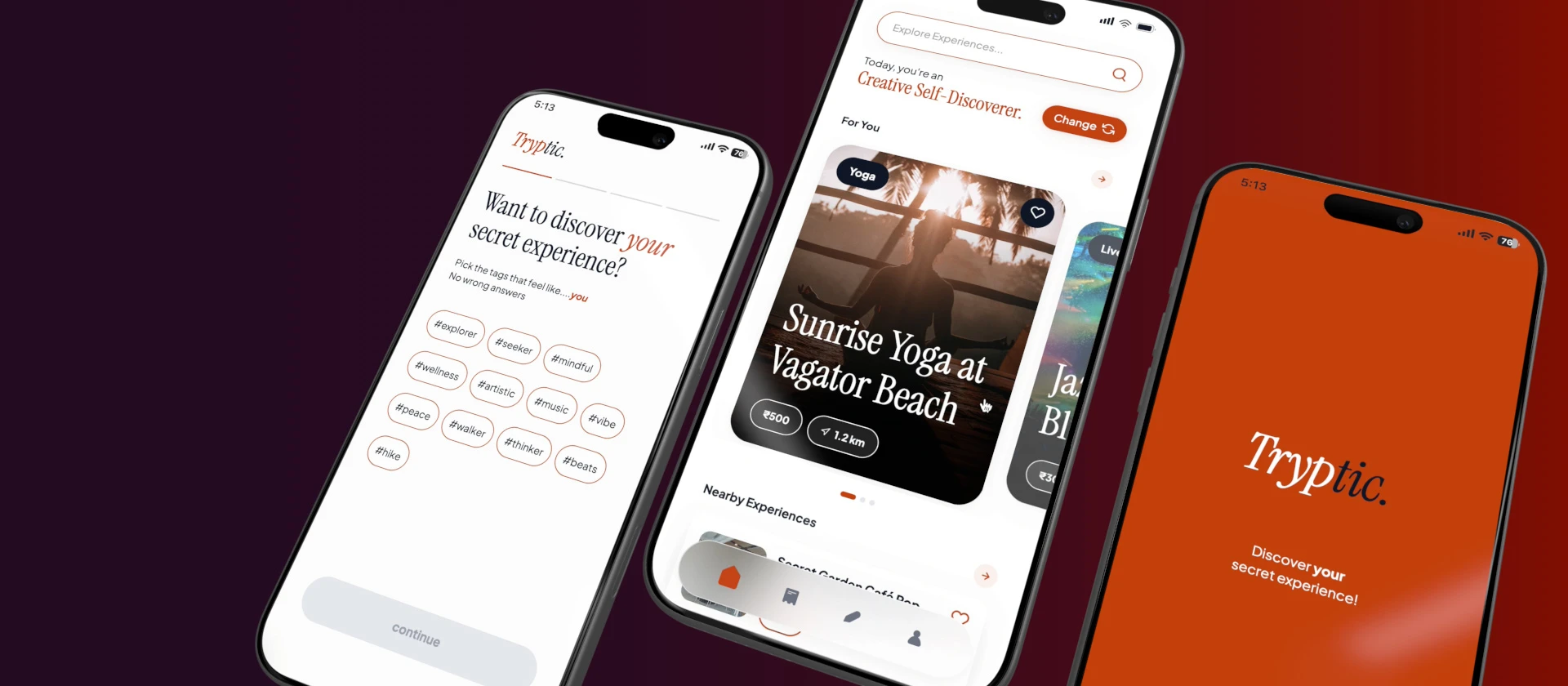
Tryptic
Tryptic isn’t another events app. It’s a discovery experience that starts by understanding you, a persona-based app that reads your instincts, your energy, your type, before showing you a single thing.
View case →
Bolt.Earth
User apps, companion apps, vehicle clusters and operator consoles for India’s largest EV charging network — one system spanning discovery, payments, and fleet operations.
View case →
STRATUM
STRATUM is a high-performance two-door electric GT coupe concept. Maximum clarity, minimum noise, in the car, in the cockpit, and in the app.
View case →
ARCON
ARCON is a compact two-door electric coupe concept for the urban young earner, designed from the inside out, and the app inward. One design language, repeated at every scale from a 19-inch wheel to a 6-inch phone display.
View case →
Sahayak
Sahayak is an organised digital system built to streamline the dispensation of critical information within India’s disability sector, and a dedicated job portal for people with disabilities, designed around the people who make it work: the helpline volunteer.
View case →

Aston Martin
A transportation design research project exploring the dualistic nature of industrial rigidity and fluid softness, inspired by the material language of the Indian sari, applied to a vehicle concept within Aston Martin’s design universe.
View case →